Brooklyn Donuts is one of Australia’s most recognisable donut and coffee franchises, bold, fun, and unapologetically indulgent. When I came on board as their head creative, the brand had drifted. Not dramatically, but enough. The visual language had started to wander from what made Brooklyn Brooklyn, and the consistency across channels, social, email, in-store screens, print, shopping centre digital displays, wasn’t where it needed to be.
The Work
My job was to pull it back. Not reinvent it, restore it, then build on it properly.
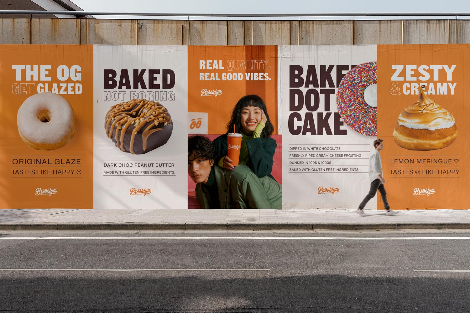
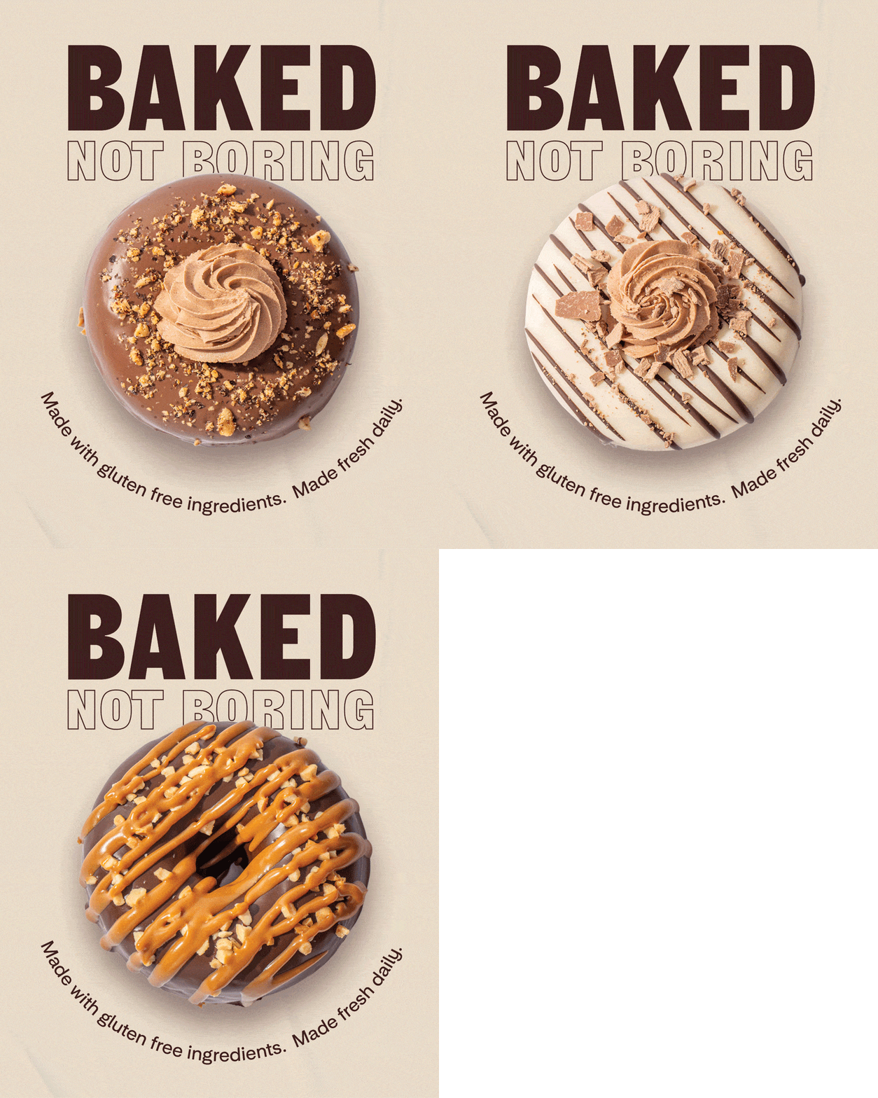
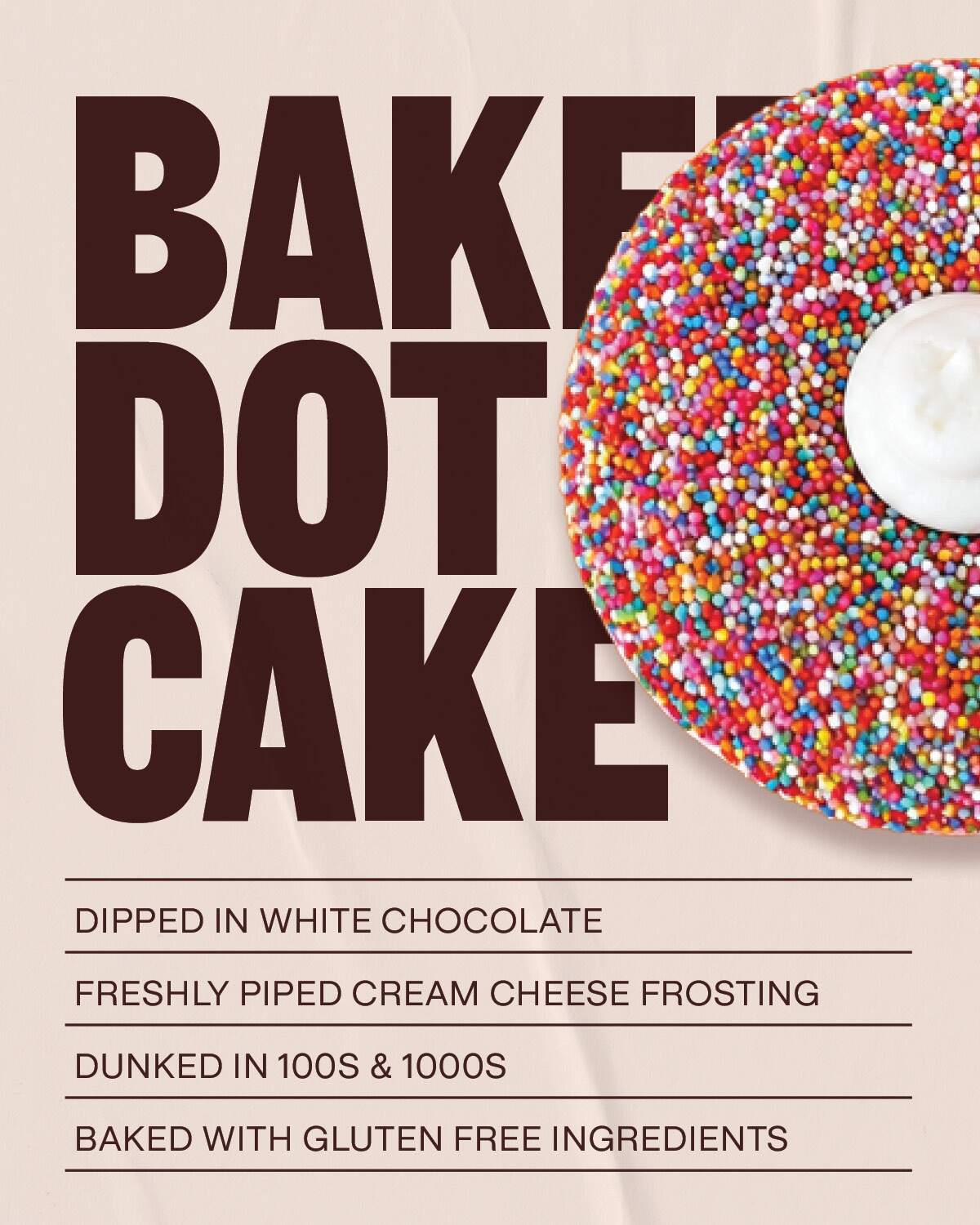
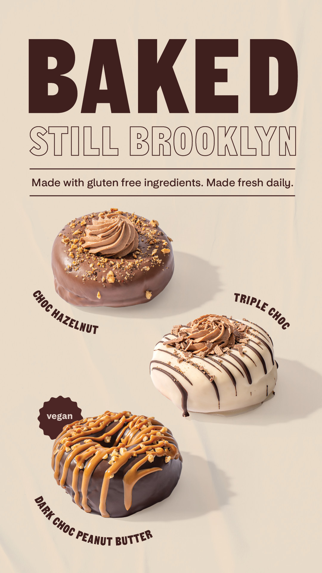
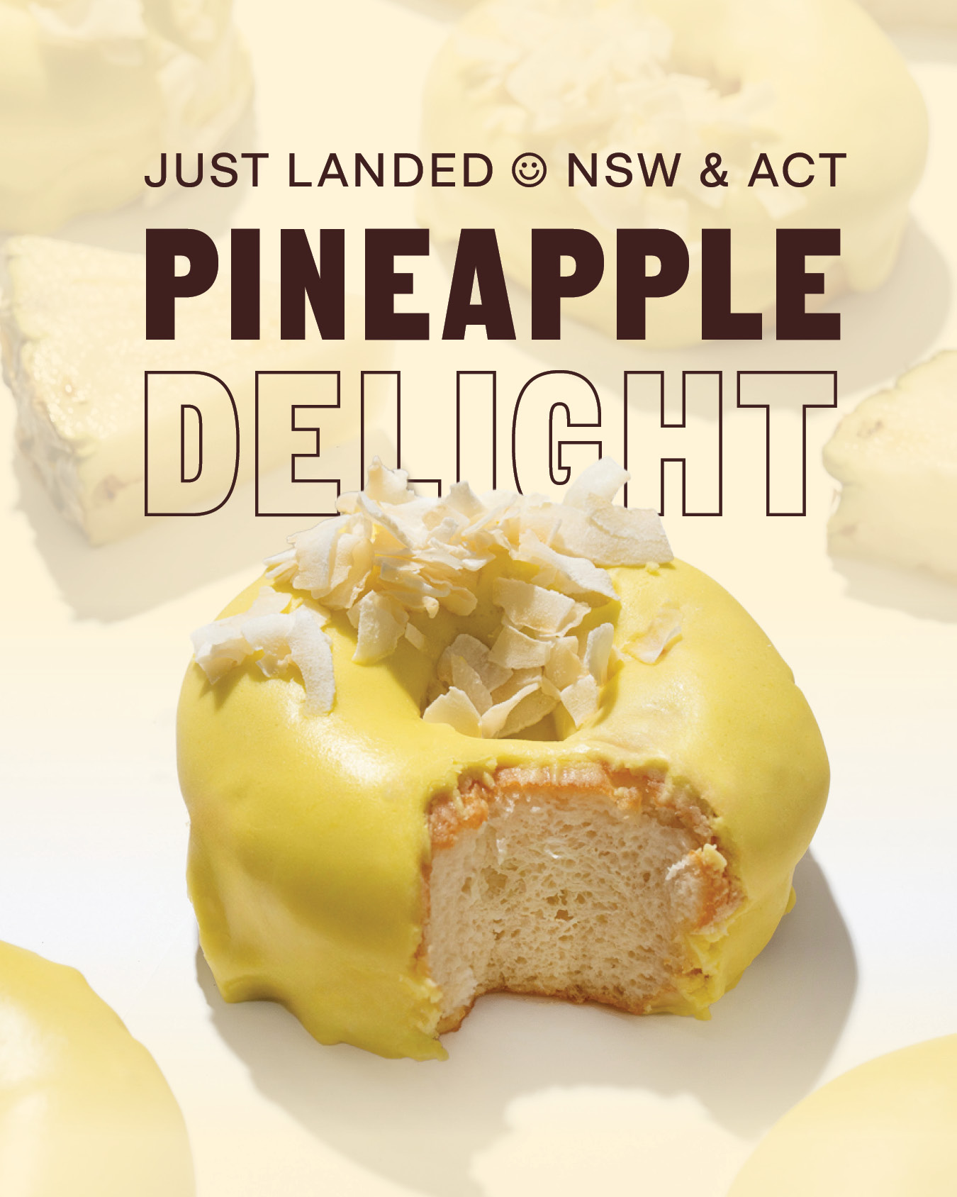
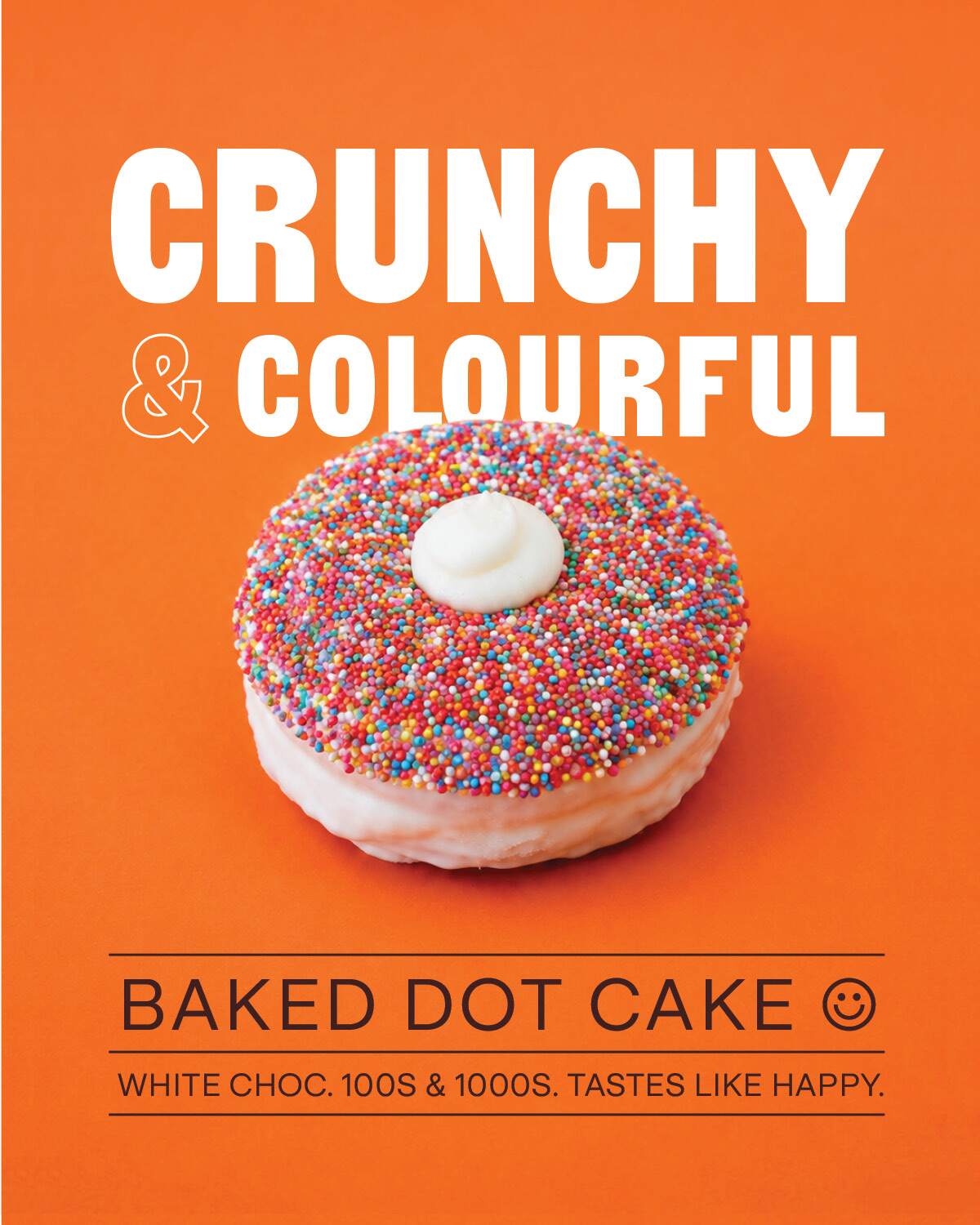
Working across a rolling calendar of campaigns and product launches, I developed the creative direction and graphic design for everything from new range rollouts to seasonal limited editions. The Baked Donut range launch, the Dot Cake drop, Donut Day, Winter Wonderland, Made for Mum, each one needed to feel like an event without losing the thread of the overall brand.
Every campaign touched multiple formats: social stills, stories, EDM creative, in-store digital screens, shopping centre displays, and print. That kind of multi-format rollout means the design decisions matter more, not less. An asset that looks great on a phone screen has to hold up at two metres on a centre screen. So every visual had to work hard across all of them.
The creative direction brought back the brand’s core energy — the punchy typography, the strong use of brand orange, the product-forward photography. All while giving each campaign its own moment. Consistent, but not repetitive. (There’s a difference, and it matters.)
The Result
The brand now looks and sounds like itself again, across every format and every touchpoint. Campaigns land with more confidence. There’s a visual consistency that makes the whole thing feel considered, because it is.
Ready to bring some consistency and creative direction back to your brand? Take a look at what I do →