NDIS Website Design & Brand Identity
A Okay Care is an NDIS provider focused on mental health, but unlike most in the space, they wanted to connect with a younger audience in a way that felt warm, modern and community-driven.
They came to me with no logo, no brand and no website. Just a clear idea of who they wanted to reach: younger people and their support networks.
So I built everything from the ground up: brand identity, creative direction, and NDIS website design on WordPress.
The Brief
Most mental health branding plays it safe. Muted colours, stock photography, language that feels like it was written by a compliance department.
A Okay Care wanted the opposite, a brand that felt warm, modern, on-trend and community-driven.
But there was a balance to strike. This is still a support service people rely on, so playful couldn’t tip into unserious. The brand needed to feel human and hopeful without losing trust. And because nothing existed yet, every piece had to be built from scratch — starting with the identity, then carrying it through to a website that actually works for participants.
What I Did
Brand Identity & Creative Direction
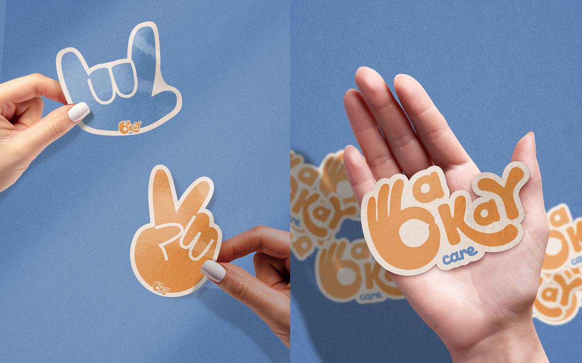
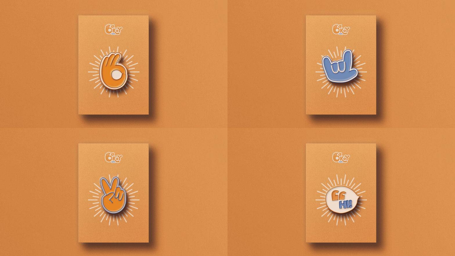
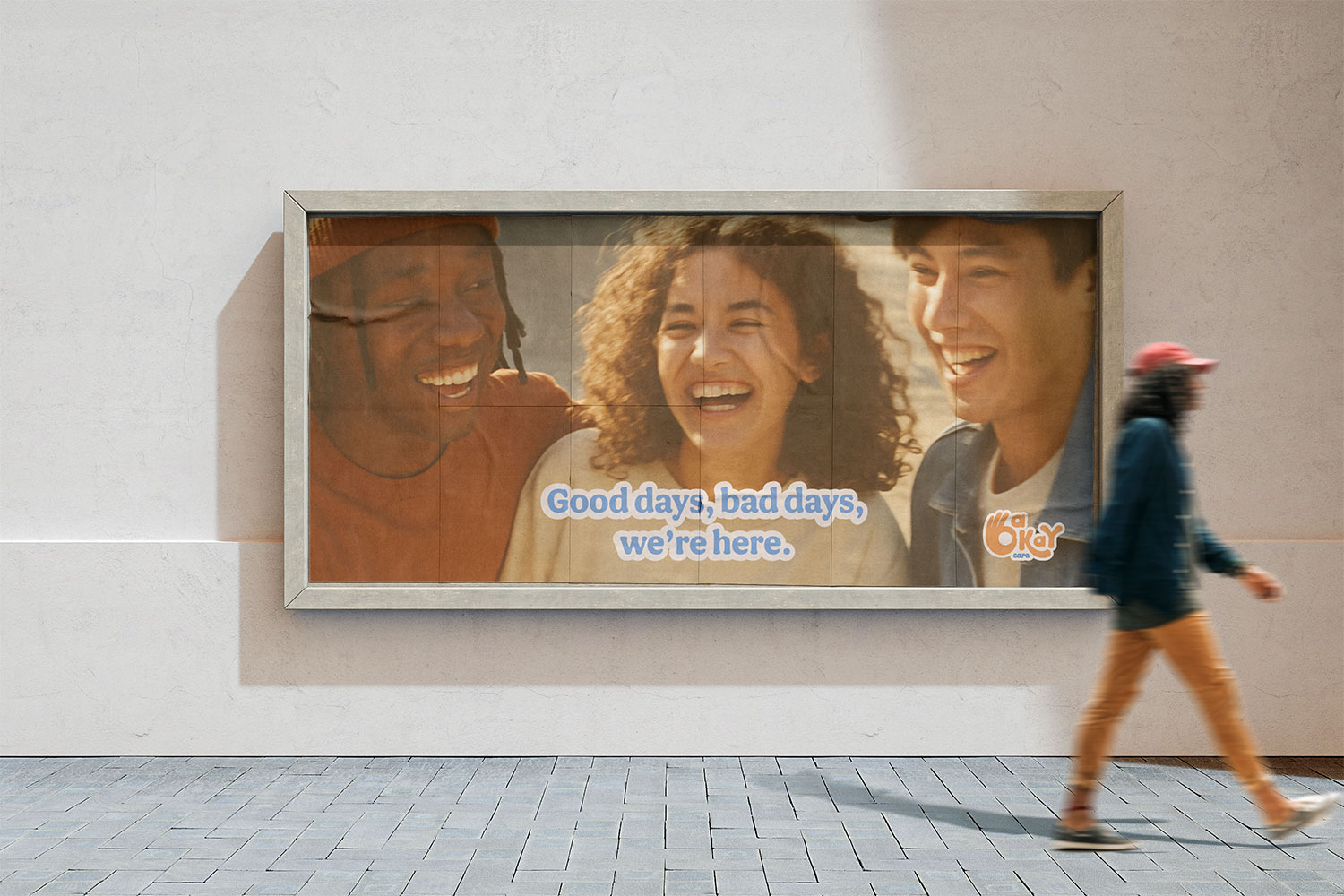
I designed a brand that’s playful with a hint of nostalgia, think 70s cartoons meets feel-good support service. (Not a combination you see on many NDIS sites, which is exactly the point.)
- Bold shapes and friendly colour blocking that feel instantly warm, not clinical
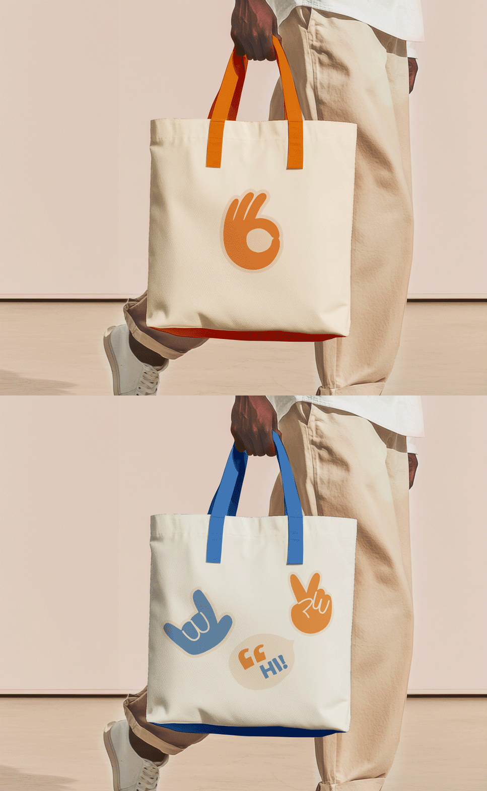
- A playful design language that leans into accessibility and self-expression
- A logo suite with the flexibility to work everywhere: from social tiles to signage.
- Creative direction that keeps every application feeling human, hopeful and full of personality
Every choice was made for connection. Younger audiences switch off the moment something feels institutional, so the brand meets them where they are instead.
NDIS Website Design on WordPress
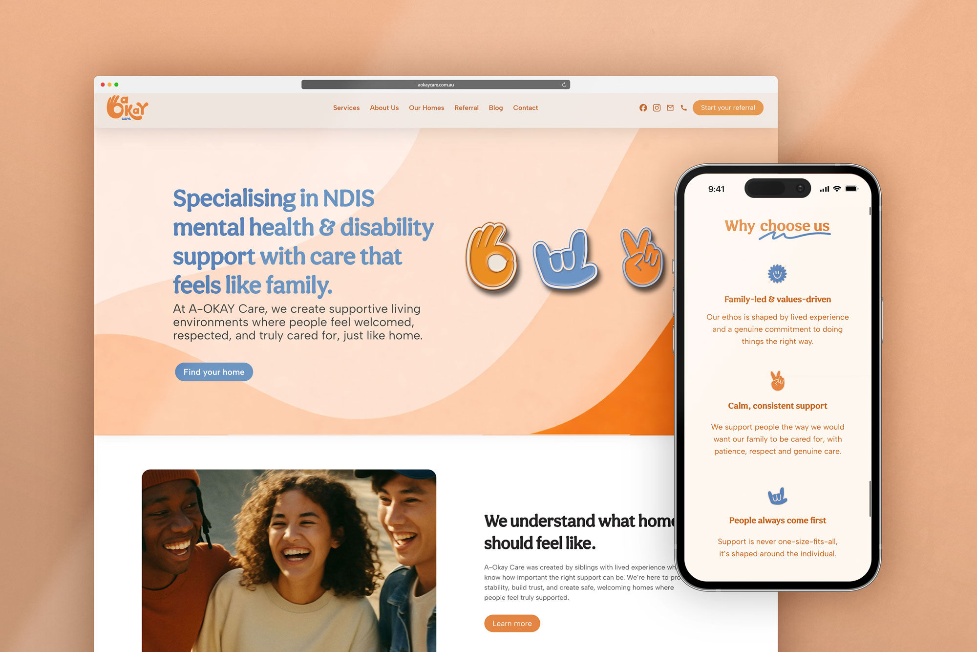
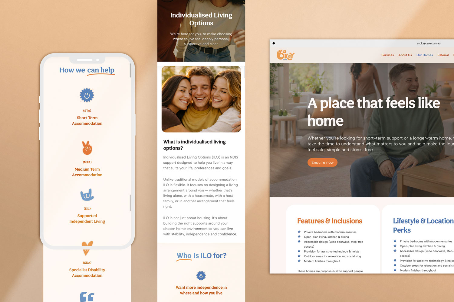
With the identity locked in, I designed and built the A Okay Care website on WordPress, bringing the brand to life across every page.
- A layout structured around how participants and families actually browse , services easy to find, no digging required
- Custom referral forms, so participants, families and support coordinators can refer online in minutes instead of playing phone tag
- Warm, plain-language copy structure that makes reaching out feel easy, not intimidating
- The full brand system carried through: colour, shape and personality on every page, not just the homepage
The Outcome
A Okay Care now has a brand and website that shift mental health support away from clinical norms and towards something genuinely approachable. It feels safe, familiar and empowering, especially for the younger audience it was built for.
Deanna’s words say it best:
“She truly brought our vision to life and perfectly captured the look, feel, and branding we wanted…
The website reflects who we are as a business, and we couldn’t be happier with the final result.”
Working on something similar?
Whether it’s a brand from scratch, a website that works harder, or both, here’s everything I do.