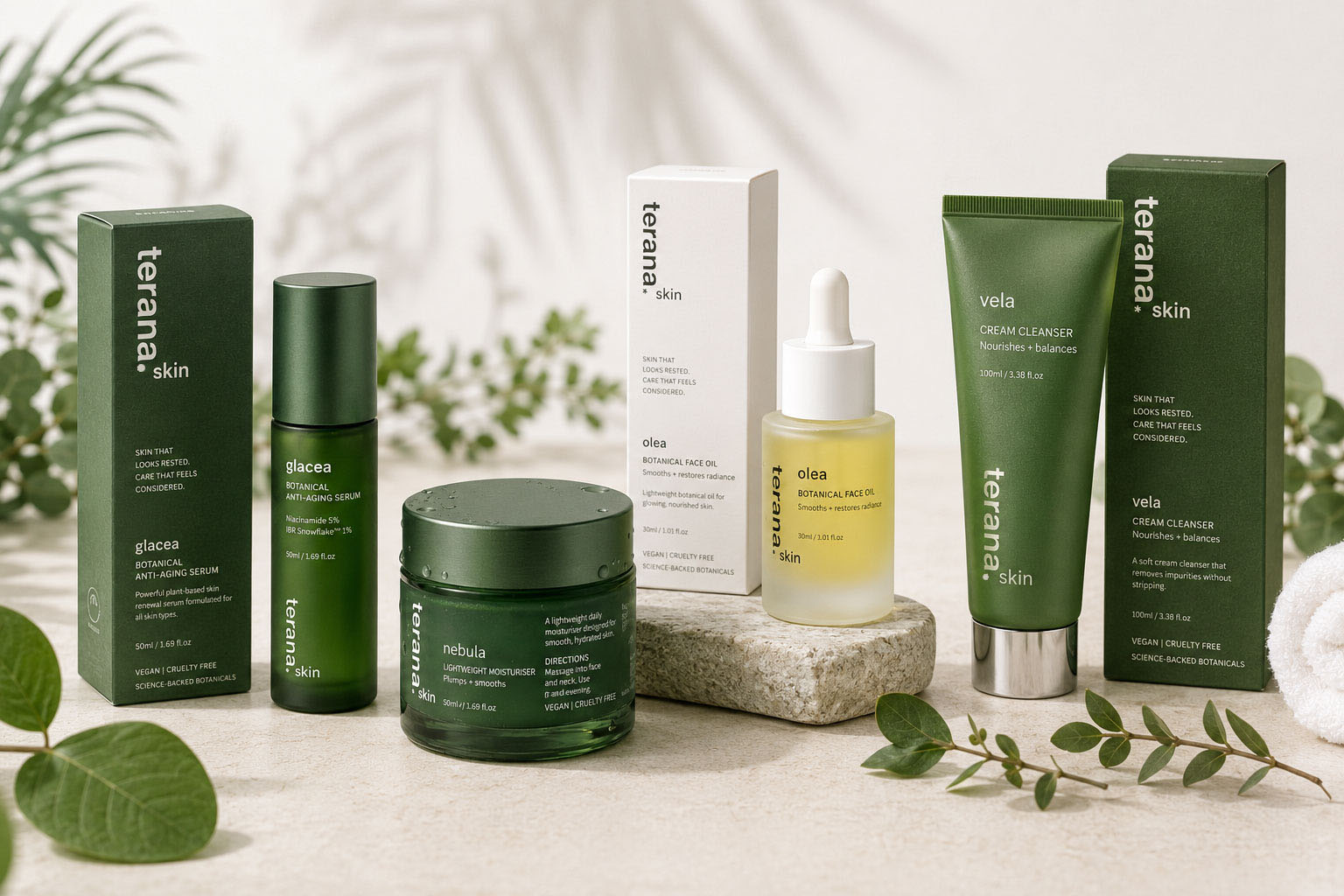
Terana Skin is an Australian skincare brand doing the hard part right: clinically backed botanical formulas, quality ingredients, real results.
The Setup
Terana Skin is an Australian skincare brand doing the hard part right — clinically backed botanical formulas, quality ingredients, real results. But the packaging hadn’t caught up to the product yet. So they came to me for a complete skincare packaging design refresh: a new creative direction to make the range look as premium as what’s inside the bottle.
Skincare packaging design built on proof
As someone who’s built a skincare brand of my own, I know how much packaging has to carry in this category.
Shoppers judge the formula by the bottle, fair or not.
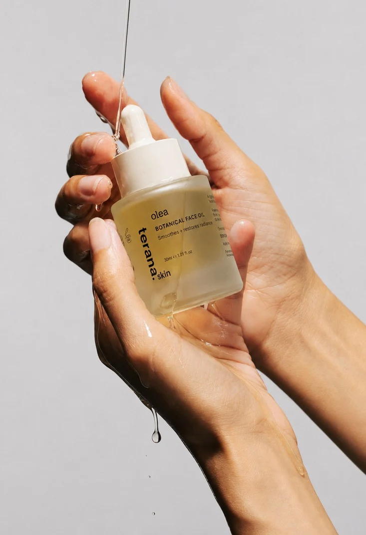
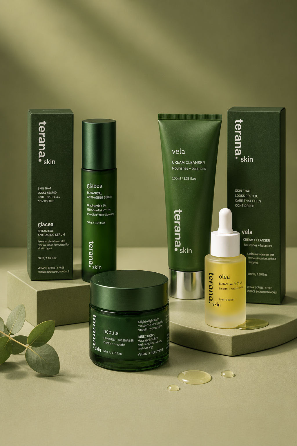
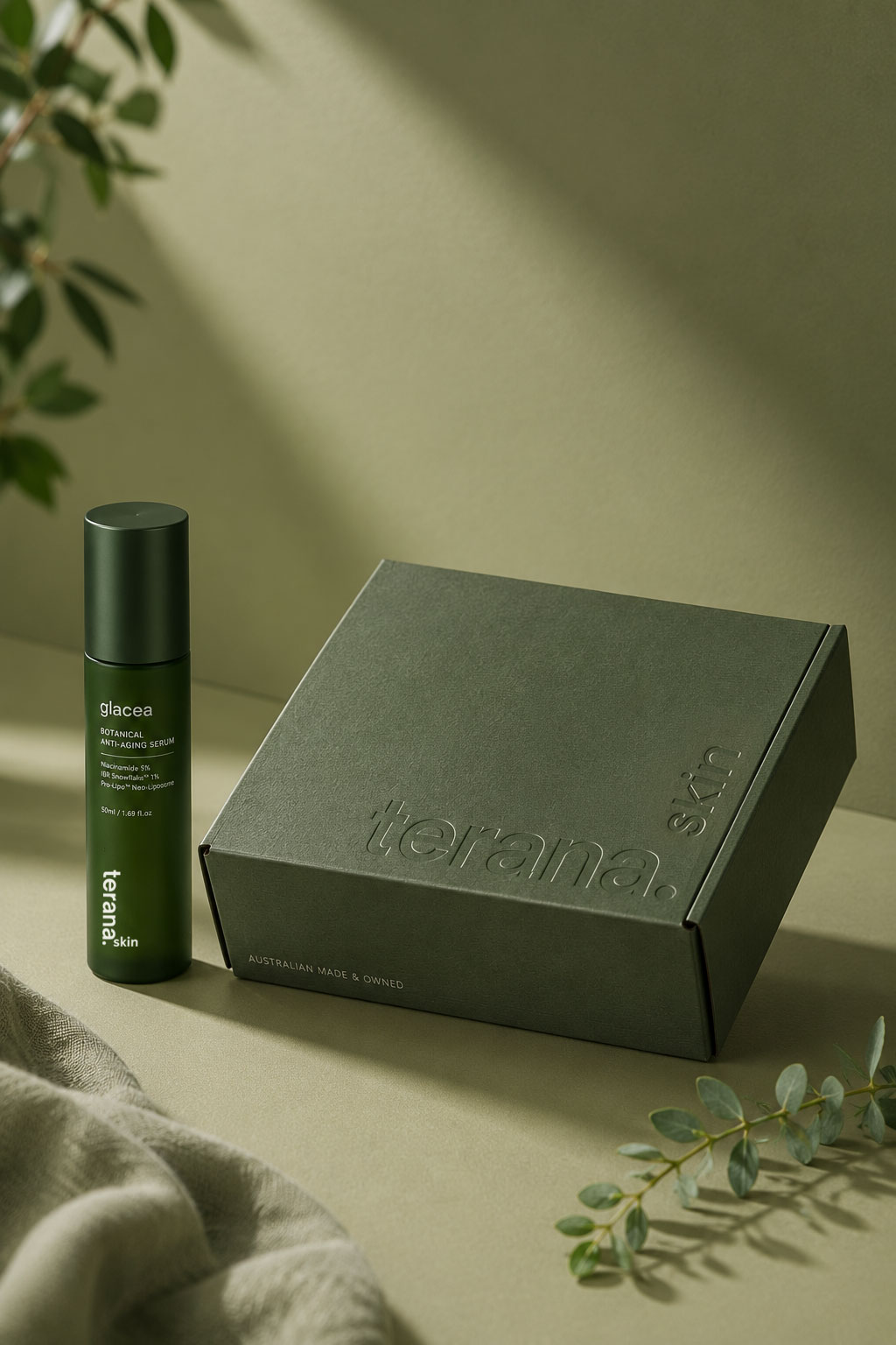
So I stripped everything back. A deep botanical green now runs across the whole range, paired with a clean lowercase wordmark set vertically up cartons, tubes and jars. It’s a small move, but it makes the line instantly recognisable from any angle, on a shelf or in a feed.
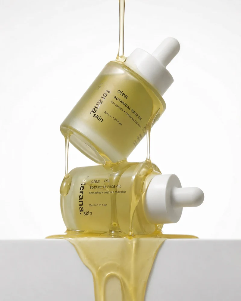
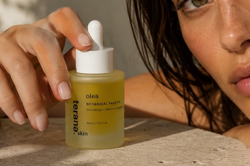
Product type is printed directly onto the glass instead of sitting on a label. As a result, the frosted bottles feel like something you’d find in a dermal clinic.
The quality story got pushed to the front of pack, too. Hero ingredients and their percentages: Niacinamide 5%, IBR Snowflake™ 1% sit right on the bottle. Because if the formulas are the proof, hiding the proof makes you just another green box.
Finally, the skincare packaging design flexes across every format in the range: cleanser tube, serum bottle, moisturiser jar, face oil and cartons, all speaking the same visual language.
The result
Terana now has packaging that looks like one brand: considered, cohesive and premium. It holds its own next to established skincare names. And the quality of the formulas is the first thing you see, not something you take on faith.
Working on a product that deserves packaging to match? Here’s how I can help.