
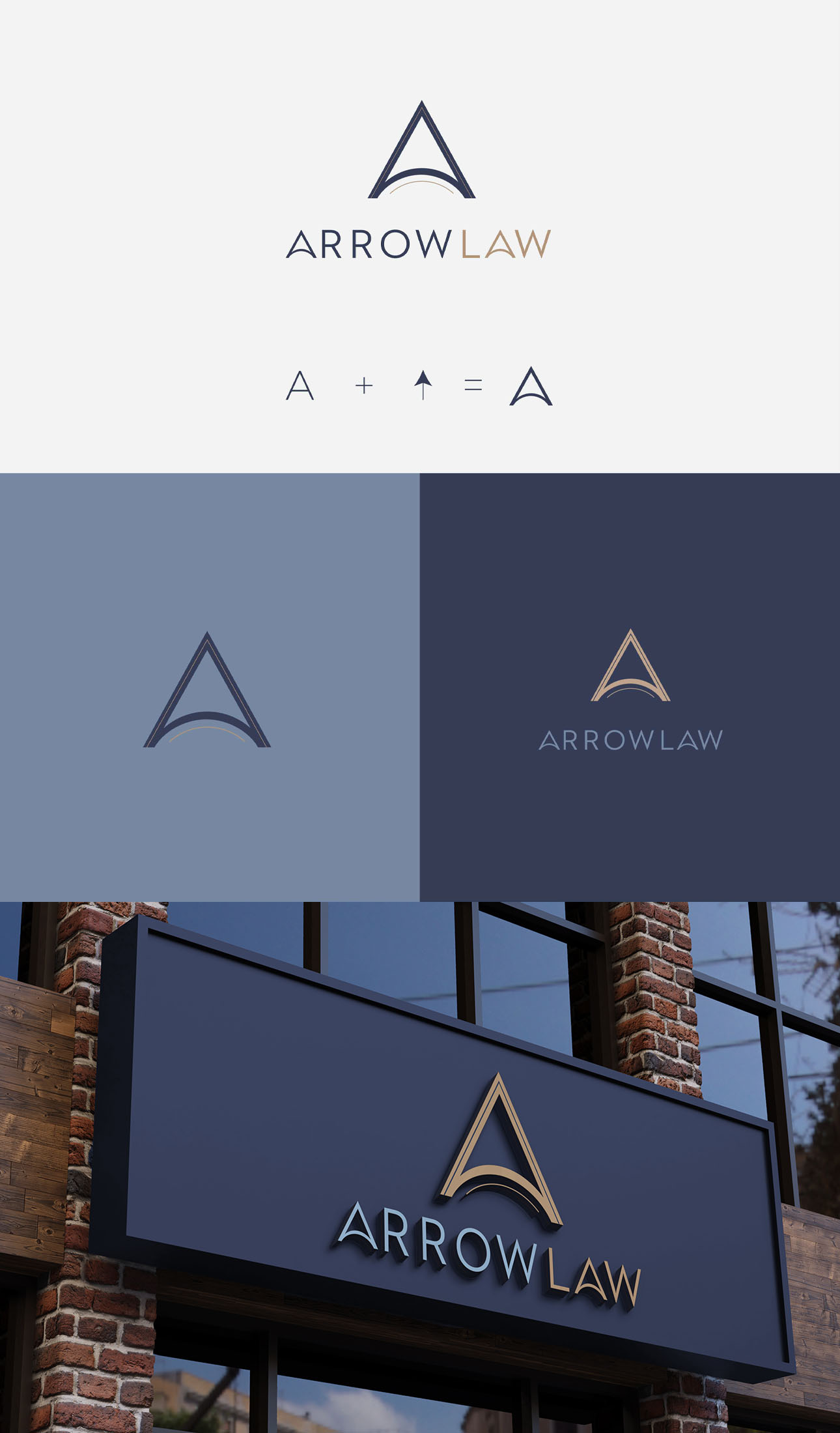
The ArrowLaw branding project is all about creating a strong and trustworthy identity for the law firm through a design that’s both sophisticated and meaningful. At the heart of the design is the letter “A,” which cleverly doubles as an upward-moving arrow. This symbol perfectly captures the brands core values and ambitions of a reputable law firm.
Symbolism
The upward arrow isn’t just a design choice—it’s a reflection of reliability and trust. It suggests that ArrowLaw is a dependable guide, always pointing clients in the right direction. The arrow represents progress, ambition, and forward-thinking, echoing ArrowLaw’s commitment to leading clients through the legal system with integrity and precision. It’s a symbol of growth and advancement, reassuring clients that they’re in capable hands.
Brand Colours
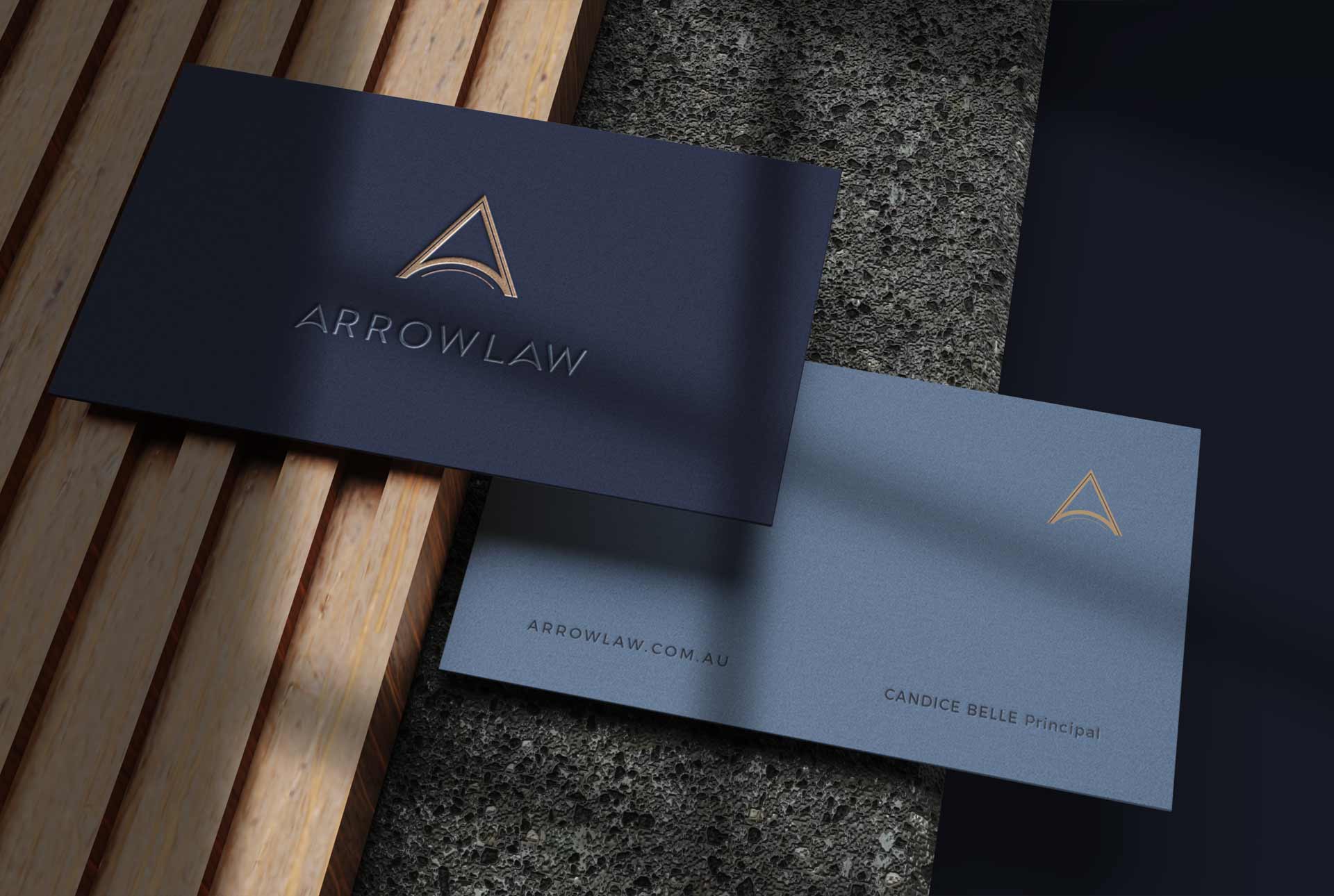
Navy blue was selected for its powerful associations with authority, elegance, and sophistication. It’s a colour that communicates reliability, reinforcing ArrowLaw’s professional image. To add a touch of success and achievement, accents of gold were incorporated. These golden highlights underscore the firm’s dedication to excellence and high standards, creating a brand identity that exudes confidence and triumph.
The Result
The design elements beautifully marry the symbolism of an upward arrow with a refined colour palette of navy blue and gold. This design effortlessly conveys trustworthiness, progress, and excellence, positioning ArrowLaw as a reliable and forward-thinking legal partner.