

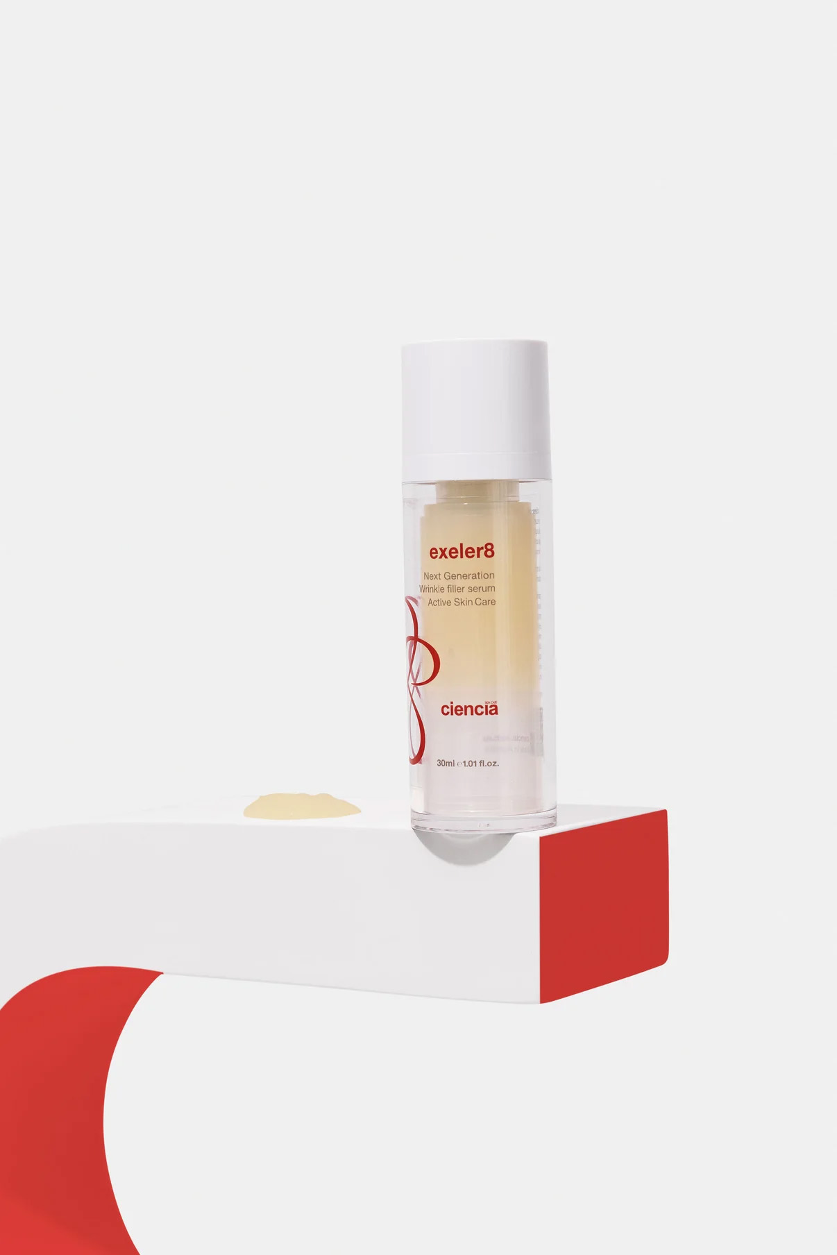
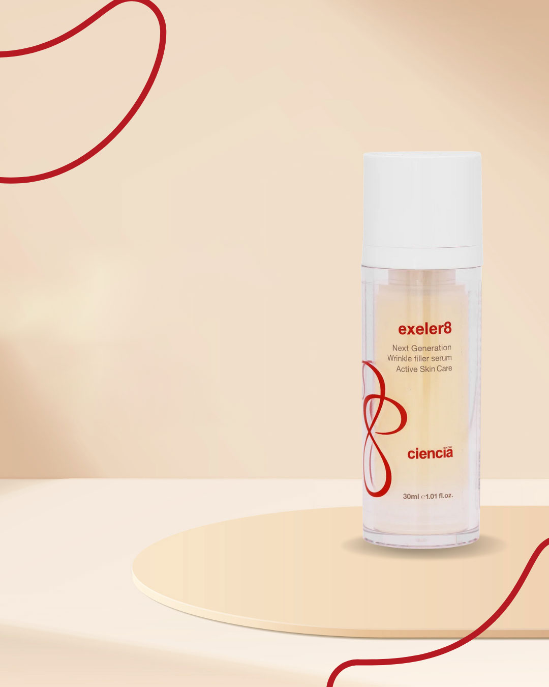
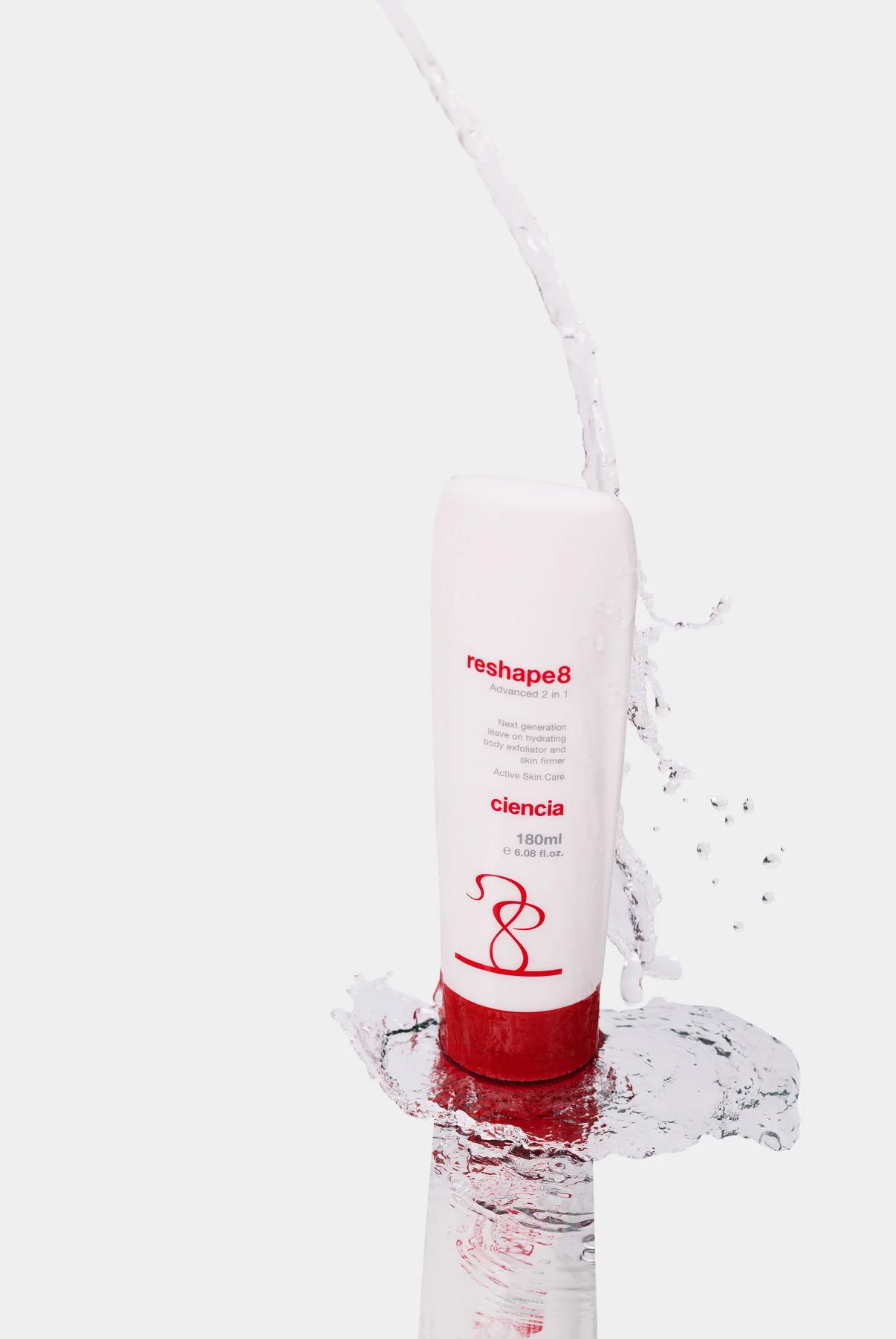
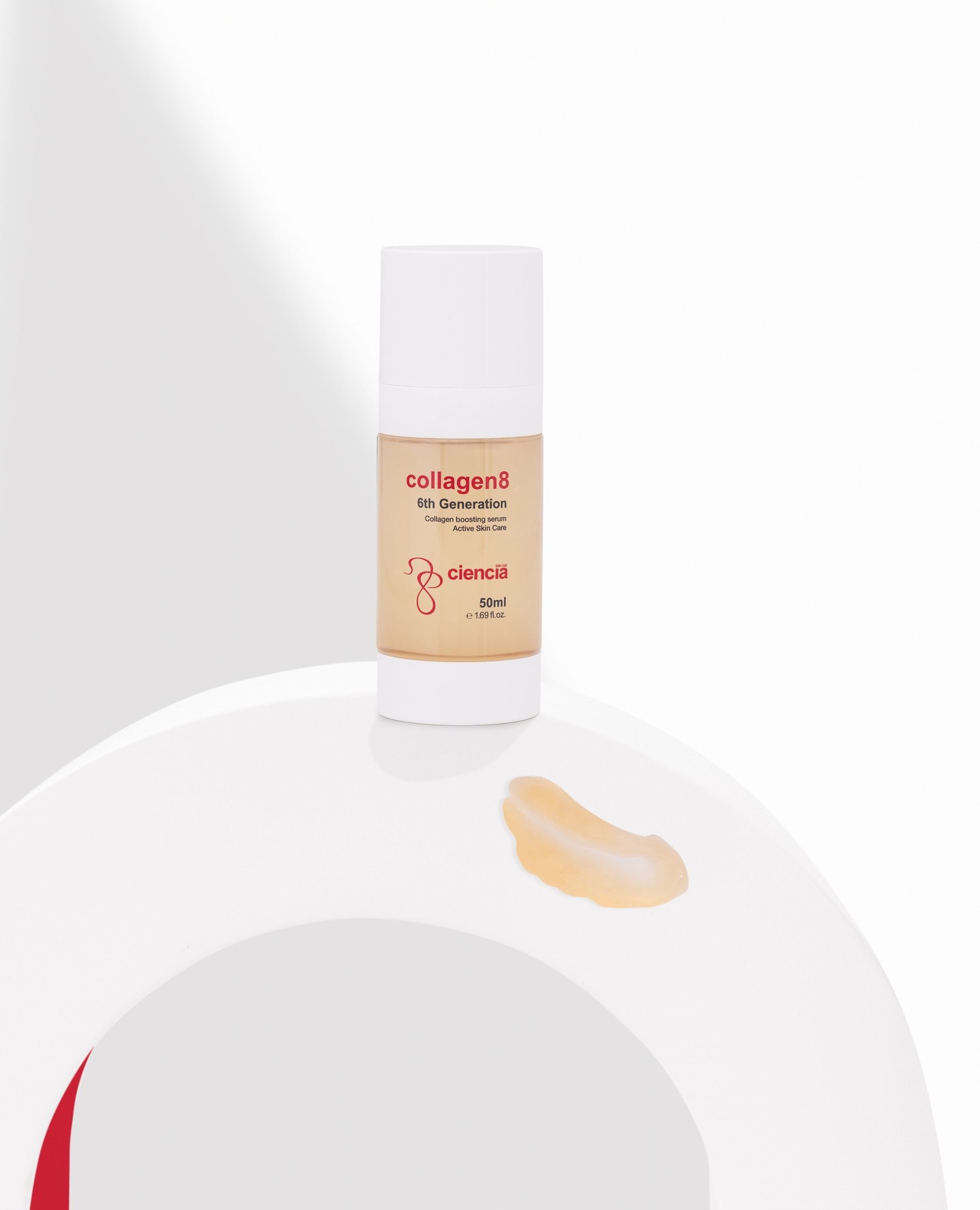
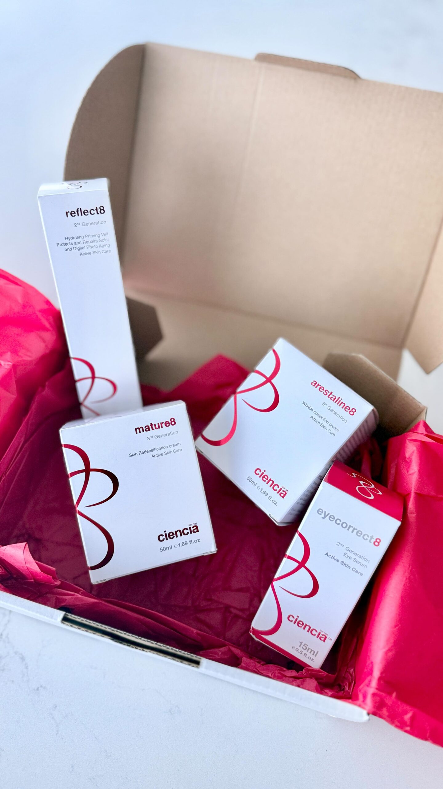
Packaging design for a results-driven skincare brand.
Ciencia is a Melbourne-based skincare brand known for science-backed formulas and real results. As they prepared to expand into the Asian market, they needed a full packaging refresh that looked elevated and consistent across every product.
Their range had grown fast, which led to inconsistencies in logos, typography, and label sizes. I stepped in to streamline everything and rebuild the look from the ground up. The goal was simple: create packaging that feels premium, modern, and completely aligned with Ciencia’s reputation for results-driven skincare.
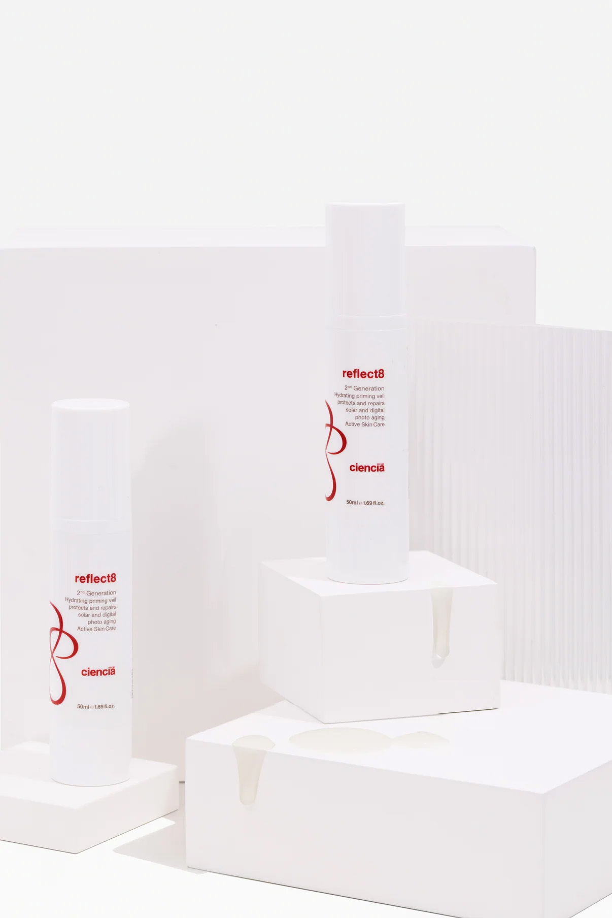
The new look uses a white, minimal base to reflect purity and performance. Red foil detailing adds a touch of luxury while keeping the clinical, trustworthy feel intact. Together, these design choices balance science with sophistication and give the brand a stronger on-shelf and online presence.
To make sure the refresh stayed consistent, I created a full packaging style guide. It includes print-ready dielines, colour specifications, and layout templates so every new product fits seamlessly into the range. This means less time spent fixing inconsistencies and more time focusing on growth.
This project wasn’t just a facelift, it gave Ciencia a visual foundation strong enough to grow with them. Every product now feels part of the same story: clean, confident, and built on science.
Looking for skincare packaging design that’s consistent, strategic, and ready to scale? Learn more.